Towing Website Design Success: Using a Responsive Website
When deciding how to approach your towing website design, there is one over-arching best practice to set yourself up for long-term success: using a responsive website.
(NOTE: This blog is a follow up to the previous post, which focused on the importance of a mobile-friendly towing website. Same objective. Different tactics. You can read it here.)
When a website is responsive, the layout and/or content responds or adapts based on the size of screen they are presented on. A responsive website automatically changes to fit the device you’re reading it on (Source). Below is quick animation of what it looks like to use mobile-responsive towing website design.
Following are three key benefits of using a mobile-friendly, responsive site for your towing website design.
1. Boost Your Towing Website Ranking
As explained in the last post, Google is now using the mobile-version of your towing website in its Mobile-First Index – the massive digital database of website content used to populate Google search results. If you only have a desktop site, Google will still use that version for the Index, but one of Google’s ranking factors is whether or not a site is mobile-friendly.
A responsive site is mobile-friendly by nature, so using responsive towing website design will give you a ranking boost over your competitor that isn’t yet mobile-friendly.
2. Site Versatility Will Save Time & Effort
Before the days of responsive website design, those trying to cater to the mobile audience found themselves maintaining two websites. If this is you, your towing website likely had a desktop version and a mobile version. This means that any site updates required two updates – one on each version.
By using a responsive layout for your towing website design, you save time and effort by only having to make one update. This also eliminates the risk of inconsistencies between desktop and mobile versions, which can negatively affect your online ranking.
3. Drive Cash Calls with User-Friendly Experience
While a responsive site will boost your ranking, it won’t drive more cash calls unless it is easy to use. Below are a few quick tips to keep in mind when implementing responsive towing website design. These all apply on a desktop site as well, but they’re even more important in converting a stranded motorist into a customer.
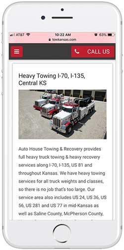
Make Click-to-Call Always Visible – the final online step to converting a search into business is the phone call. Be sure the user is always able to make a phone call to your towing company with one click, no matter where they are on your site.
Use Simplified Navigation – finding your content on specific services, like motorcycle towing or heavy recovery, should be a simple and obvious path. Make it easy to navigate the different areas of your site with a collapsible menu. There are different ways to do this, but you’ve probably experienced this before with the “hamburger” button.
Incorporate Quality Photos – people are visual creatures and many of our decisions are influenced by what we see. Photos of your fleet or an action shot of a crazy recovery is a good way to keep people on your site. Find a photo that represents your company’s values and services and place it at the top of the page. A responsive website will resize the images according to screen size.
Towing website design is an important part of building your online identity and brand. From ranking to versatility to user-experience, a mobile-friendly, responsive website is the surest way to deliver on all fronts and drive cash calls.


